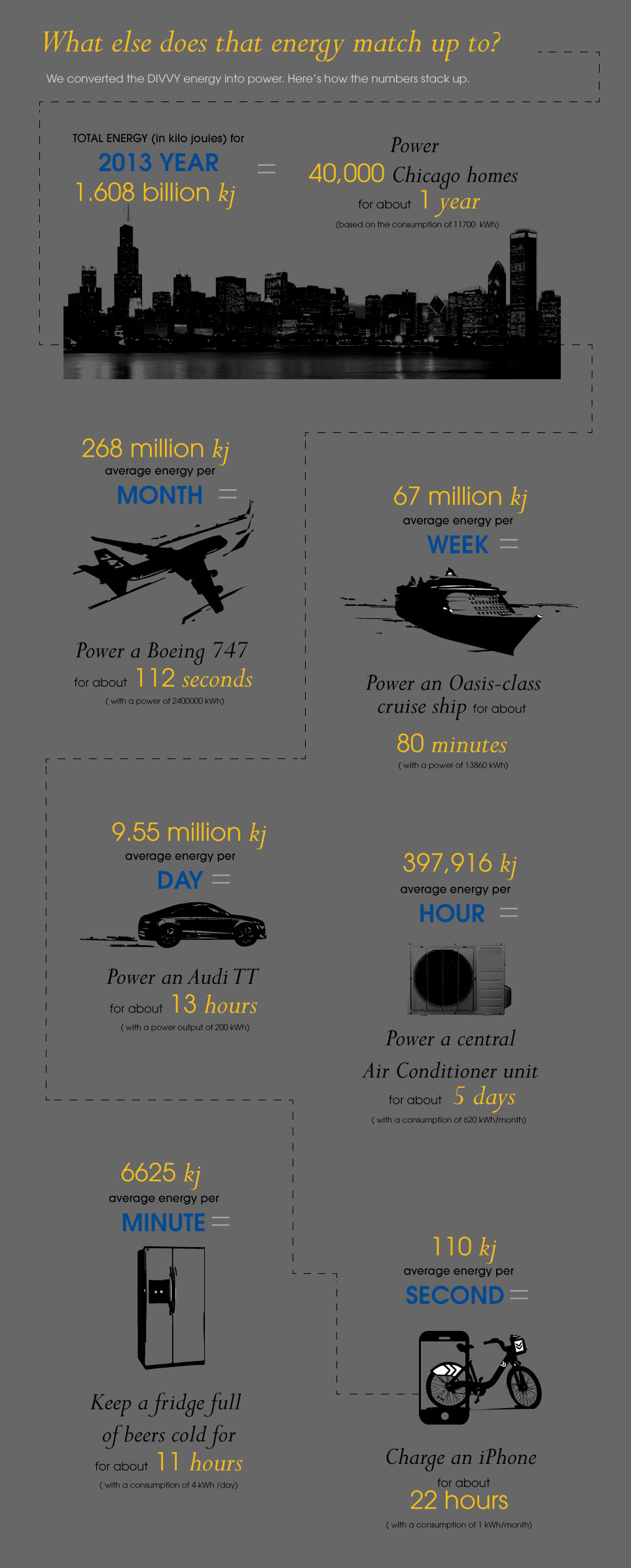
With all the talk of the country having an energy crisis, we wanted to see just what kinds of energy people generated. We calculated how much energy was used on each ride to get from station to station. Then we added up all that energy at the destination stations as way to collect it, like it was deposited there. In our data visualization we mapped all the rides to those stations so people could explore how each station did in the city. It's pretty impressive how dedicated Chicagoans are to DIVVY based on the amount of energy they spend on it. It must be love.
DIVVY Realtime Rides tabulates the amount of energy used during Divvy rides. For each destination station you can see:
- number of trips per month
- total distance traveled per month
- total time spent getting to that station
- average time per ride
- average speed per ride
- TOTAL POWER used getting to that station
- AVERAGE POWER used getting to that station
Red dots represent female subscribers. Blue dots represent male subscribers. Yellow dots represent customers.
The shade of the background changes to reflect daytime or nightime.
The user can adjust the rate of playback with the + and - keys.
DIVVY Energy Bursts shows a residual trail for each ride and a flash of energy at the destination station.
Energy, calculated in joules, is equal to the energy expended (or work done) in applying a force of one newton through a distance of one meter.